What are the top typography tips for mobile web design?

A website’s primary purpose is to communicate a message to its audience, and while this is best conveyed with the use of text, there are several pitfalls that web designers can fall into if they don’t take enough care with their use of typography.
Poor typography can sometimes be the difference between a successful website, and one that nobody visits because they can’t easily read what’s being displayed. We all know how short the attention span of the average internet user is, and how lacking in patience most are when faced with a site that is slow to load, or difficult to understand. With this in mind, it’s easy to see how important typography can be, so let’s look at it in a little more detail:
Do you need basic typography knowledge before designing a website?
In short, yes! However, if you’re working with a reputable web design agency, this is not quite so essential, since they’ll have adequate knowledge. If you’re going it alone on the other hand, you’ll definitely need to familiarize yourself with the basics:
What is typography?
Encompassing everything that relates to the written language on a screen, typography is both an art form and a skilled, design technique.
Why is typography important in mobile design?
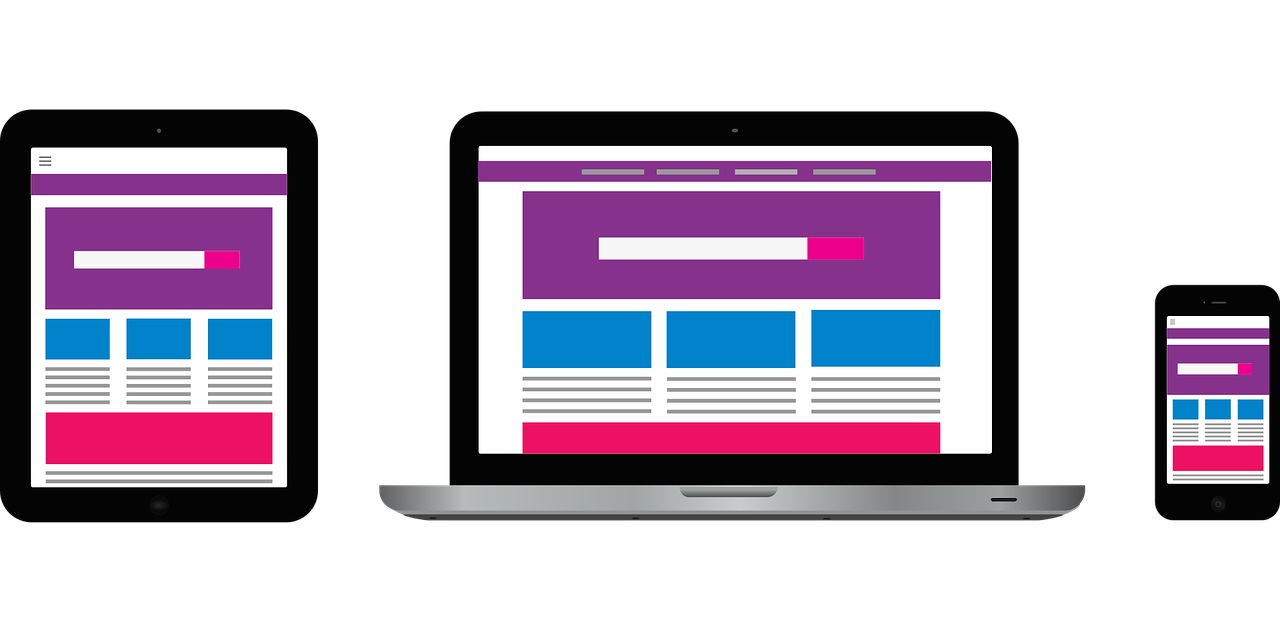
Giving your content the opportunity to be more clearly, easily read by users, typography can enhance the overall user experience when viewing a website on a mobile device, and since more and more of us are using mobile devices to access the internet, it simply makes good business sense.
Below are some top typography tips for mobile web design:
Use a small number of fonts and keep the size regular
Using multiple fonts may seem like a simple way to make your site appear more interesting, but instead, it often serves only to confuse and perplex the user. At most, a well-structured website should feature 3 different fonts, and familiar fonts are often the most successful, such as Arial, Times New Roman and Calibri. Understanding how different fonts complement each other is vital if you do decide to use more than one, and for an expert opinion, consult with a qualified web designer.
Font size can also have a dramatic impact on a text’s credibility, and the size of the font is directly proportional to how important the message being conveyed in the text is. Aside from the use of capitals to convey a sense of urgency, excitement or even anger, text size should be standardized throughout the content. One other consideration when selecting a font size, is the age of your target audience.
Limit the number of characters used in a line or sentence
A single line with a limited number of words is always going to have more impact than a long sentence, and web design professionals will tell you that having around 60 characters per line is key to improving the readability and eligibility of a sentence on a standard web page, while a mobile-friendly page should limit the use of words to between 30 and 40.
Try to keep an appropriate line-height between words
To make a sentence easy to read and visually appealing to a user, the line-height between the text should be 30% more in comparison to the height of each character.
Select fonts that are easy to differentiate between
Try to always use fonts that enable the reader to tell the difference between the characters in the words, as some fonts tend to be confusing when used in conjunction with one another.
Keep capital letters to a minimum
Any web design professional well versed in typography will tell you that using capital letters on a web page should be kept to a minimum. When only capital letters are used, a sentence can become almost ineligible, so try only to use them for single words or a single line where appropriate.
Check your color contrast
Using the same color for text as you have for the background, can be a real eyesore, and take the reader far longer to make sense of text than if the colors had been adequately contrasted. When using short sections of text, the contrast ratio should be between 4:5:1 against the background, while when using longer sections of text, the ratio should be around 3:1 against its background.
Keep color blindness in mind
For people with certain eye conditions, some text can be hard to read when certain colors are used, such as red and green. Conduct research before composing your text and choosing what colors to use, or simply use the expert services of a professional web design agency.
Always use correct text alignment
Readability can be hugely impacted by incorrect alignment, and a website should carefully choose its text alignment in accordance with the type of content being displayed. If you’re not sure, as with any of these points, consult with a professional web designer Toronto.
NEVER use blinking text
This can have a seriously damaging effect upon certain individuals, and blinking text has been known to cause seizures in some users. While you might think it looks appealing and draws attention to your message, the consequences simply make it not worth using.
With mobile-friendly web design never having been so important, or necessary, web designers are now paying more attention to typography, than ever before. Fortunately, with so many simple tips available to help novices get their typography right, there’s little excuse for slip-ups. However, should you require further guidance about the use of typography, or simply want a professional to get it right for you, then don’t hesitate to contact an experienced and reputable web design agency, today.


