Qualities of a good logo: a guide to crafting the perfect design
Every other day, you come across several logos. The question is, how many of them stick to your brain cells?
For sure, a few of them. Here one thing is sheer clear; what is memorable is what sells!
To get a bright spot in a cutthroat competition, it is imperative to have “the perfect logo” else you will keep rocking the boat of your business.
A good logo represents what a company has to offer speaks a lot about its standards and professionalism.
An innovative and creative logo grabs the customer’s attraction, thereby earning your business or startup the recognition it deserves. Moreover, logos are often able to associate their identity in a specific business niche without the mention of a brand’s name. This is one of the few qualities of exceptional logo design.
But what makes a logo creative enough to stand out?
Here are a few qualities to keep in mind while crafting a logo design
1. Minimalism
Complicating the design is not the best option as it could potentially distract people. That’s where minimalism comes into action.
Minimalism is all about keeping it simple. It is the use of minimum elements with maximum simplicity and is the key to having a professional yet elegant logo. It works on the idea of “less is more” and is often used across creative mediums like arts, literature, music, cars, food, businesses, etc. Minimal designs may look effortless and straightforward, but they are usually one of the most challenging as they demand creativity and uniqueness.
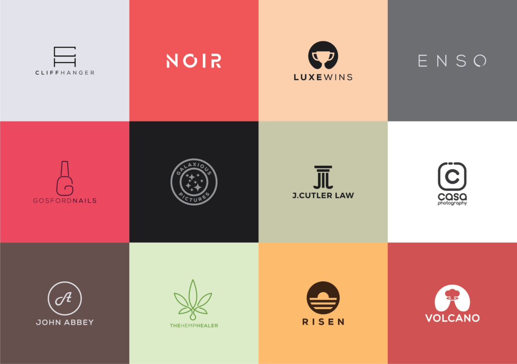
The fundamental rules of minimal graphic designs are:
- Less is more
- Keep it simple
- Leave empty spaces
- Keep the bare necessity
- Use grids to maintain order
- Implement a flat design
- Keep it balanced
2. Size and Font
It is imperative to watch out for size while making a professional logo design. It must be size-effective and fit onto every item such as billboards, letterheads, pens, etc.
What looks good on the billboard might not look as good on the letterhead. Making sure that the appropriate size fits all is very crucial. Selecting the right color and font are also essential elements; font selection speaks volumes of the business type and helps the customer get a general idea. Capitalization and bold letters might not suit every logo design. For instance, the logo of a wedding organizing business will require a cursive font type to represent delicacy and exquisiteness.
3. Color Scheming
Another key factor that attracts most customers is the selection of the right color. It is essential to keep in mind who the target audience is. For instance, when designing a logo of a toy store, it is crucial to choose a wide variety of colors to add to the playfulness.
Cristopher Wallace of Design Festival says that “The important thing a logo needs to do is to speak to your target audience. If you run a children’s toy store, it’s not crucial to have an image of a toy in your logo or to have the word ‘toys’ in there either. What is more important is to use a color scheme or font that is childlike and appeals to kids.”
4. Captivating Design
Simple and easy designs tend to stick to our hippocampus better than the complicated ones. Therefore, the logo must be “catchy” enough for the people to remember easily. The only way to make that work will be to use uncomplicated minimal designs. For instance, the logo of McDonald’s is simple yet captivating. Anyone who has seen it once can recall it instantly.
5. Longevity
While designing a logo, it is essential to crafting something that would remain trendy over the years and not go out of style over time. Minimalism is the current trend and will most likely stay that way for a while. Graphic design, David Airey, wrote on his site, Logo Design Love, that
“Trends come and go, and when you’re talking about changing a pair of jeans or buying a new dress, that’s fine, but where your brand identity is concerned, longevity is key.”
6. Appropriate Crafting
When designing a logo, it is crucial to keep in mind that the visual imagery relates to the business type. For instance, Burger King uses an image of a burger on their logo, which signifies that it is a burger place. Sticking to the right image is a rule you must while crafting a professional logo.
7. Choosing the right texts and symbols
The best professional logo designs include having appropriate texts and symbols.
It isn’t necessary to include both, one will suffice. The font type should gel well with the tone of your logo. Using symbols that appropriately describes the business type is vital. Creativity also goes hand in hand in crafting an emblem that stands out from the rest.
Creating the logo
There are various routes one could take to craft the perfect business logo Maker. These include the following options:
- Independent Designing
Freelancers and Upwork workers might be the best option if you are planning on low budgeting yet professional logo design. Make sure to go through their portfolios before hiring.
- Logo Designing Software
If you have a streak of creativity, all you need is a bit of technology to head you in the right direction. Using your Photoshop and Illustrator skills might help you here.
- Graphic Designing Firms
The perfect option would be to get your logo designed by a graphic designing firm. They are more experienced and will provide you with the best facilities.
Wrapping up
You can’t take the risk when it comes to the image of your business. Your logo introduces you to the customers before you tell them about your products. Minimalism is the latest approach for logo design.
The challenging aspect is to make a logo that is unique and overshadows the rest in the battleground. More and more graphic designers are now embracing the minimalistic designs. After all, it’s all about keeping it simple yet elegant. Hope you found this quick-guide helpful enough. If you think that we have missed anything, feel free to tell us in the comment section.


